How to build a keyword ranking monitor for launch terms in an AI-search market
A launch can feel like it disappears into a fog. The page is live, the announcement has gone out, and dashboards start filling with data. Yet the numbers that arrive first are often the least useful: a few branded visits, an isolated position change, perhaps a spike from employees sharing the launch internally.
A keyword ranking monitor gives that early period some discipline. Instead of treating the launch as a single traffic event, it watches the handful of search terms where prospective buyers are deciding what the new page, feature, or campaign means. That distinction matters because search results may settle slowly, while AI-generated answers can start framing a category, a comparison, or a buyer question before a page reaches a stable position.
Google itself cautions that rankings can fluctuate after broad core updates, and a single change does not automatically point to a problem with a site. For a launch team, that means early measurement needs context. One ranking chart rarely has enough of it.
The better question is: Are we appearing when the right buyer asks the question, and what evidence supports the answer they see? A focused monitor answers that question weekly. It pairs conventional ranking data with answer inclusion and the sources named or linked in those answers. Broad traffic still matters, of course. It just arrives later and tells a messier story.
Why post-launch traffic can send you in the wrong direction
Picture a software company releasing a new workflow feature on a Tuesday. By Friday, the campaign dashboard reports a healthy rise in visits to the launch page. The team celebrates, then discovers that most of those visits came from the company name plus “new feature.” Category searches still surface incumbent vendors, review sites, and older explanatory pages.
That is not a failed launch. It is a measurement problem.
Branded demand tells you that people who already know the company are paying attention. Category visibility tells you whether unfamiliar buyers can find the new message while researching a problem. Those are different motions, and combining them into one traffic line hides the gap between them.
AI answer layers complicate the picture further. A person may ask a detailed question, read an answer that mentions a competitor, then never click a traditional result at all. Or an answer may include your company but cite an old help article that uses outdated positioning. Rankings alone will miss both situations.
Definition: A launch-term monitor is a recurring record of priority buyer queries, their organic positions, their appearance in AI-generated answers, and the pages those answers name or cite.
Look, no team needs to inspect 500 terms the week after publishing. That creates a spreadsheet-shaped anxiety machine. A launch monitor works because it starts narrow enough for a human to notice patterns: a message mismatch, a missing proof point, an uncrawled page, or a competitor that keeps appearing in comparisons.
The more I’ve reviewed launch reporting, the more I’ve come to prefer a smaller set of terms with annotated evidence over a huge rank-tracking export. The first tells you what to change. The second often tells you only that the internet remains weird.
Pick terms that mirror the buyer’s decision
Start with the buyer’s language, not the internal name for the project. Product teams tend to describe what they built. Buyers search for the problem, the alternative, the risk, or the result they want.
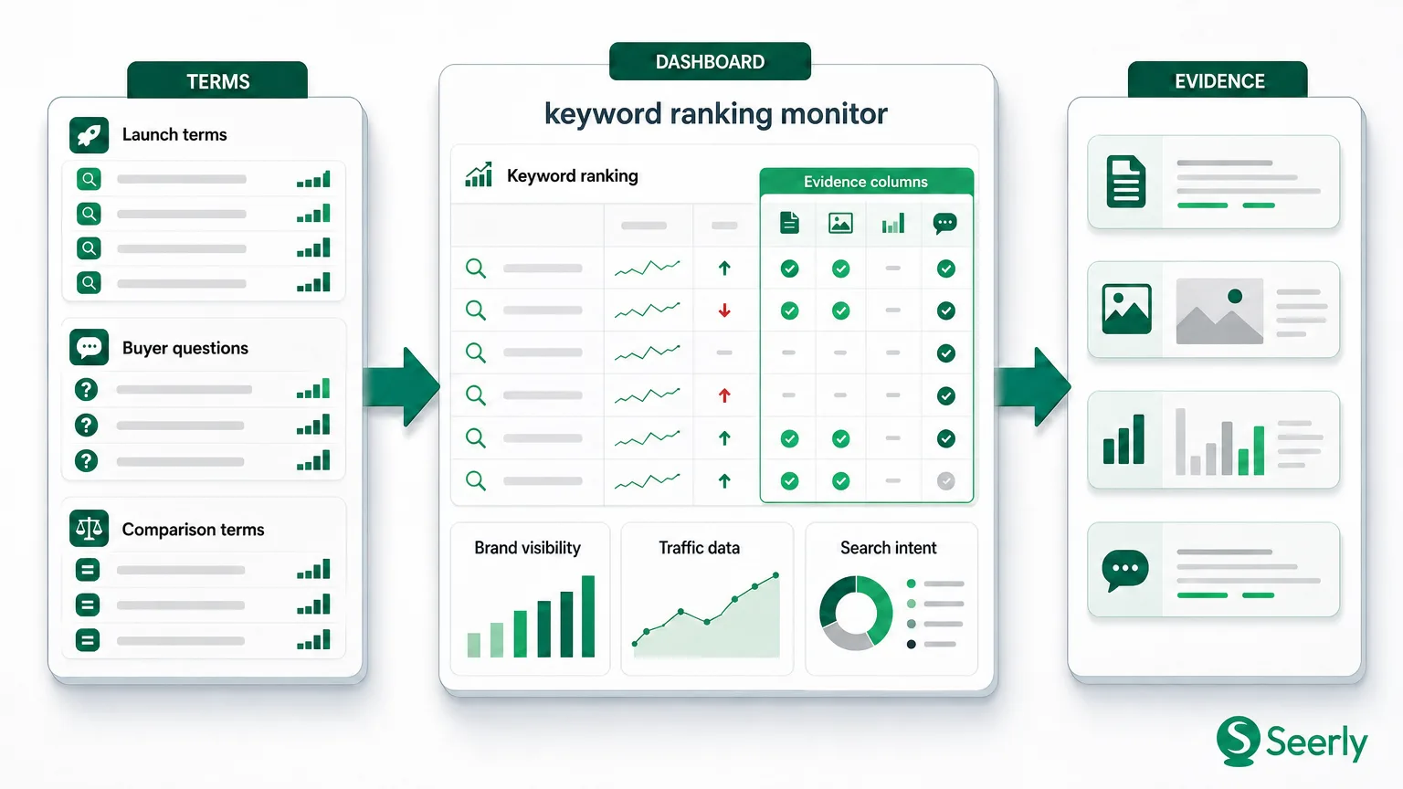
For most launches, 12 to 25 terms are enough. Split them into four groups, then make each group earn its place. A query belongs on the watchlist only if an appearance or absence would change a decision about content, distribution, or technical work.
Brand terms reveal message pickup
Brand terms combine the company or product name with the launch concept. Examples include “Acme forecasting feature,” “Acme workflow automation,” or “Acme data retention.” Keep these separate from plain company-name searches, since a temporary burst in general brand interest can make a launch look stronger than it is.
Watch whether the search result text and AI answers use the phrasing you intended. If your announcement calls the feature “continuous forecasting” but answers keep describing it as “budget planning,” you have learned something useful. The market may be translating your language, or your page may not explain the distinction clearly enough.
Solution and comparison terms expose category demand
Solution terms describe the job to be done, such as “forecasting software for seasonal inventory” or “automated data retention policy.” Comparison terms include a choice: “best forecasting tools for retailers,” “Acme vs. Northstar,” or “alternatives to spreadsheet forecasting.”
Comparison queries deserve attention because they expose the evidence buyers expect. If competitor pages appear repeatedly, note the proof they use: integrations, implementation time, customer examples, pricing, or compliance detail. Don’t copy their page word for word. Do identify where your own launch page leaves an obvious question unanswered.
Evidence terms test whether the claim holds up
Evidence terms ask for validation. They often include words such as “case study,” “security,” “pricing,” “implementation,” “accuracy,” or “reviews.” They can feel less glamorous than headline category terms, yet these queries often sit closer to a real purchase conversation.
A feature launch claiming faster reporting, for example, may need terms around “reporting automation implementation time” and “reporting automation data accuracy.” The audience is not only looking for a feature list. They are asking, quietly, “Can I trust this in my environment?”
If the watchlist feels too broad, use buyer-question research informed by Google Trends to cut vague terms before monitoring begins. You want queries that signal a decision, not a cloud of loosely related vocabulary.
Build a keyword ranking monitor with three evidence columns
The tool matters less than the habit. A spreadsheet can work for a small launch; a dedicated platform helps when you monitor many markets, devices, or answer providers. Either way, every row should record one query in one location and language. Mixing US desktop results with UK mobile results is a fast route to nonsense.
Create a starting snapshot before publication. Record the current ranking, the ranking URL, the present AI answer result, and any pages linked or cited by that answer. Save a screenshot or export when possible, because answer layouts can change without warning.
Use this four-step process:
-
Set a baseline three to seven days before launch. Record the term, search intent, country, device, current ranking, and URL. A blank baseline is still data. It tells you the launch did not inherit existing presence for that question.
-
Check the same query set under fixed conditions. Use the same location, language, device, and query wording each time. Google’s Search Console bulk data export documentation is a useful reminder that serious analysis depends on retaining granular records rather than relying only on a changing interface.
-
Capture answer-surface evidence. For each term, mark “included,” “mentioned without link,” or “absent.” Then record the cited or linked page, the publisher, and the exact claim connected to it. If an answer names your brand but links to a third-party review, that deserves a different interpretation than an answer linking directly to your launch page.
-
Add an owner and a next action. A monitor without a response field becomes reporting theater. Assign a person and a date for each pattern: revise copy, add a proof section, request indexing, improve internal linking, publish supporting material, or wait for another crawl.
A simple table might look like this:
| Priority term | Organic position | Answer inclusion | Linked or cited page | Interpretation | Next action |
|---|---|---|---|---|---|
| inventory forecasting software | 18 | Mentioned, no link | Competitor category page | Brand enters answer, but proof is weak | Add implementation detail |
| Acme vs. Northstar | 6 | Included with link | Acme comparison page | Message matches the page | Watch weekly |
| forecast accuracy case study | Not in top 50 | Absent | Industry publication | Evidence gap | Publish customer proof |
I personally prefer a separate “change since last review” field. It forces the reviewer to describe movement in plain language, not merely paste a number. “Moved from 18 to 11 after the page was recrawled” is useful. “Green arrow” is not.
For teams monitoring answer results across providers, a cross-provider monitoring workflow can keep those observations comparable. Provider differences are normal. Recording them is wiser than pretending one result page speaks for every buyer.
A four-week dashboard, with the messy parts included
A four-week view is long enough to spot a direction and short enough to keep the launch team engaged. Assume a B2B analytics company launches a page around “inventory forecasting automation” with 16 priority terms.
During week one, the dashboard may show no ranking change on most solution terms. That is boring, but expected. Check crawlability, internal links, canonical tags, and whether the page is actually indexed. Google’s guidance on making content available to Search still applies: search systems need to discover and understand a page before they can rank it consistently.
The same team might see five branded queries rise sharply, while only one category query enters the top 30. Don’t call that traction across the category. Label it accurately: strong launch awareness, early category discovery. Precision in the weekly note keeps executives from drawing a larger conclusion than the data supports.
By week two, the pattern becomes more interesting. Three comparison terms start mentioning the company in answer text, but the linked evidence points to a press release and a partner announcement, not the feature page. I was skeptical when I first saw this kind of pattern. Turns out, it often means the market has registered the announcement but cannot yet find the detailed proof a buyer needs.
After a recrawl in weeks three and four, look for convergence. Organic position, answer inclusion, and cited-page quality should begin moving in the same direction. If rankings improve but answers keep citing competitor research, publish better evidence. If answer inclusion grows while the launch page remains buried, improve the page’s internal links and topical support.
A recrawl does not guarantee a rise. It does give you a cleaner point at which to compare the old page state with the new one. Keep the annotation. Future-you will be grateful when someone asks why the chart moved on a Thursday.
Don’t let normal volatility trigger a false alarm
Ranking data is twitchy, particularly around launches. The first response should be curiosity, not a frantic rewrite.
Use this checklist before escalating an apparent loss:
-
Check the time window. A one-day movement from position 9 to 14 is a signal to watch, not a verdict. Compare a seven-day view and the same device and location before changing the page.
-
Separate provider changes from message failure. One answer provider may drop your mention while another adds it. Review the query wording, answer format, and cited pages before deciding the content has a problem.
-
Discount branded-query spikes when judging category reach. A successful email campaign can lift “Acme forecasting” searches without moving “inventory forecasting software.” Keep the two groups on different charts.
-
Inspect the ranking URL. A blog post may outrank the new landing page for a priority term. That is a routing issue, not necessarily a demand issue. Strengthen links and clarify which page should answer the query.
-
Check the result-page weather. Industry volatility trackers exist because rankings can shift across many sites at once. If the whole results page is churning, wait for a second or third observation before treating your launch as the cause.
Point being, a monitor should stop bad decisions as often as it starts good ones. A dashboard that turns every wobble into a red alert trains people to ignore it. Not ideal.
Questions teams ask when setting up launch monitoring
How many launch terms should we track?
Start with 12 to 25, divided across brand, solution, comparison, and evidence terms. A smaller set lets the team inspect actual answer text and cited pages rather than watching aggregates. Add terms only after the original set produces a clear pattern or exposes a missing buyer question.
How often should we review the monitor?
Review the first two weeks twice weekly, then move to a weekly cadence until patterns stabilize. Daily checking tends to magnify noise, especially for terms outside the top positions. Keep a monthly record as well, since category progress often appears later than launch activity.
When should we change content?
Change content when repeated observations point to the same gap: buyers seek proof you do not publish, answers describe the feature inaccurately, or a weaker page keeps ranking for the intended term. One isolated dip does not warrant a rewrite. Repeated absence across several priority terms does.
When do technical fixes deserve escalation?
Escalate quickly if the launch URL cannot be indexed, uses the wrong canonical signal, returns an error, or lacks internal links from relevant pages. Those issues can block discovery before the quality of the message even enters the conversation. For ranking changes without a technical symptom, gather at least two review cycles of evidence first.
Broad reporting has a place after a launch. It just should not be the first instrument panel you trust. Build a priority watchlist, record rank position alongside answer inclusion and cited-page patterns, then review it weekly until the picture stops shifting.
That is the discipline worth keeping: fewer terms, better evidence, less storytelling after the fact. What would your team learn if every launch report started with the buyer questions that matter most?